11.1 Example: European Countries Gasoline Consumption Data
Data is obtained from Abay Mulatu 316ECN Applied Econometrics lecture material, Coventry University.
We start by loading the required libraries.
library(tidyverse)
── Attaching core tidyverse packages ──────────────────────── tidyverse 2.0.0 ──
✔ dplyr     1.1.4     ✔ readr     2.1.5
✔ forcats   1.0.0     ✔ stringr   1.5.1
✔ ggplot2   3.5.1     ✔ tibble    3.2.1
✔ lubridate 1.9.4     ✔ tidyr     1.3.1
✔ purrr     1.0.2
── Conflicts ────────────────────────────────────────── tidyverse_conflicts() ──
✖ dplyr::filter() masks stats::filter()
✖ dplyr::lag()    masks stats::lag()
ℹ Use the conflicted package (<http://conflicted.r-lib.org/>) to force all conflicts to become errors
library(Hmisc) # add labels to variables
Attaching package: 'Hmisc'

The following objects are masked from 'package:dplyr':

    src, summarize

The following objects are masked from 'package:base':

    format.pval, units
library(ggplot2)library(dplyr)
We will start by looking a a sub-group of two countries: Italy and Denmark and then move on to do estimations using the complete data on 18 countries.
For ease of typing, I called this data as df. In the code below, df will refer to the gasoline-demand-IT-DK data we imported.
11.1.2 Task 2
Label variables.
# library(Hmisc)label(df$L_gas_cons_pcar) <-"Logarithm of gasoline consumption per car"label(df$L_income_pc) <-"Logarithm of real income per capita"label(df$L_gas_price) <-"Logarithm of real gasoline price per gallon"label(df$L_cars_pc) <-"Logarithm of number of cars per capita"
11.1.3 Task 3
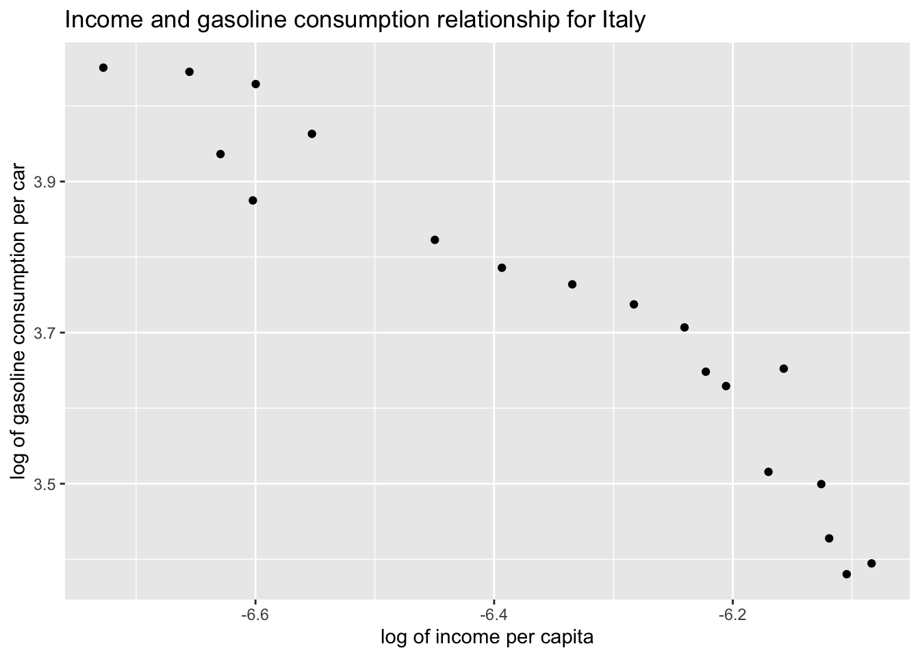
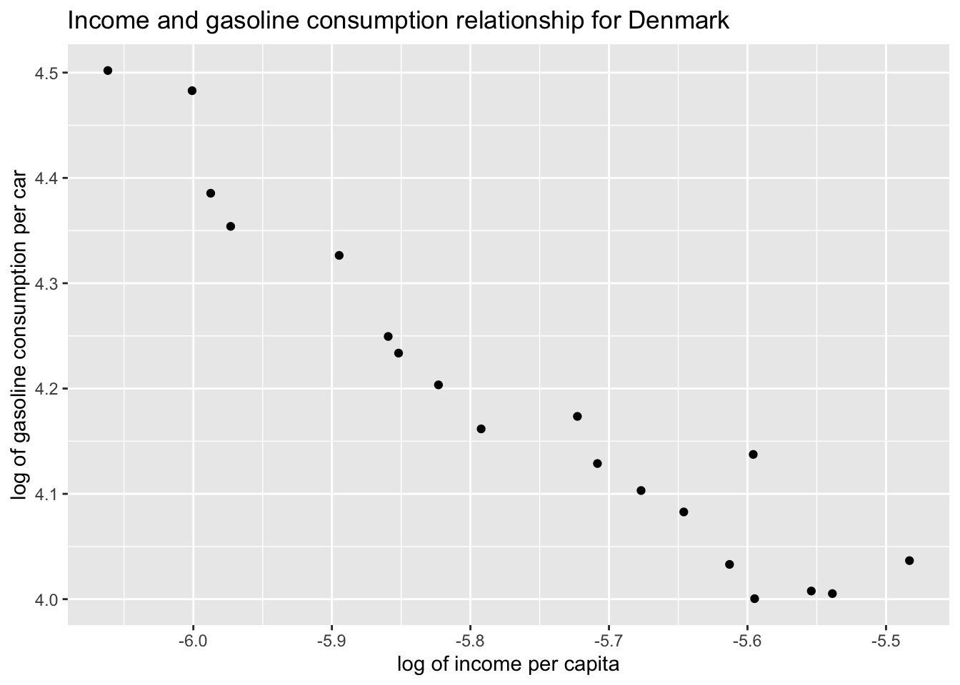
Produce a scatter plot of gasoline consumption by car versus income per capita separately for Italy and Denmark.
11.1.3.1 Guidance
Let’s first create data frames for Italy and Denmark.
ggplot(df_Italy, aes(x = L_income_pc, y = L_gas_cons_pcar)) +geom_point() +labs(x ="log of income per capita", y ="log of gasoline consumption per car", title ="Income and gasoline consumption relationship for Italy" )
# Save the plot# ggsave("./plots/panel-data-analysis/italy.png")
We can do the same for Denmark
ggplot(df_Denmark, aes(x = L_income_pc, y = L_gas_cons_pcar)) +geom_point() +labs(x ="log of income per capita", y ="log of gasoline consumption per car", title ="Income and gasoline consumption relationship for Denmark" )
# Save the plot# ggsave("./plots/panel-data-analysis/denmark.png")
Both countries depict a negative relationship between income per capita and gasoline consumption by car. As the income per capita of Italy or Denmark increases, the gasoline consumption per car declines. What could be the reason of this pattern? Please provide a reasonable explanation.
11.1.4 Task 4
Now, rather than focussing on each country separately, let’s work with a panel data of these two countries.
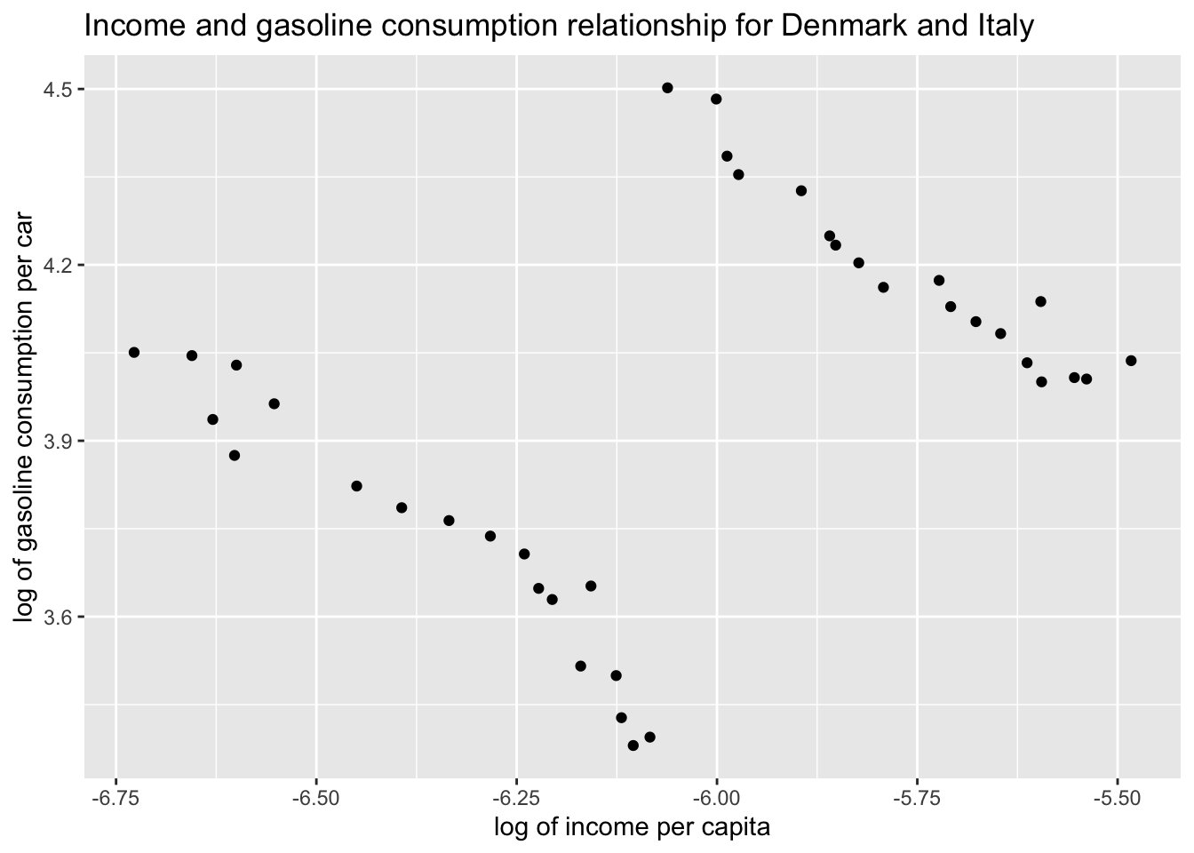
Provide a scatter plot of the two indicators in both countries. Assign different colors to each country data points.
Let’s first draw the scatter plot
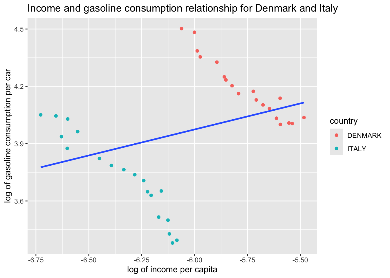
ggplot(df, aes(x = L_income_pc, y = L_gas_cons_pcar)) +geom_point() +labs(x ="log of income per capita", y ="log of gasoline consumption per car", title ="Income and gasoline consumption relationship for Denmark and Italy" )
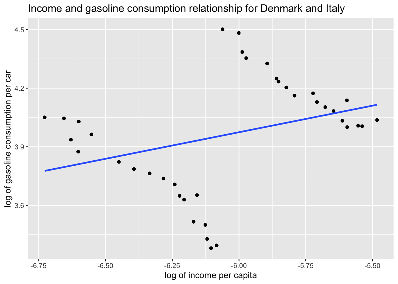
Add a regression line to the data points above:
ggplot(df, aes(x = L_income_pc, y = L_gas_cons_pcar)) +geom_point() +geom_smooth(method ="lm", se =FALSE) +labs(x ="log of income per capita", y ="log of gasoline consumption per car", title ="Income and gasoline consumption relationship for Denmark and Italy" )
The above plot fit an OLS regression line to the data points in our scatter plot. But it seems like something is wrong. Separate scatter plots for Denmark and Italy revealed a negative relationship between log income per capita and log gasoline consumption per car whereas the above regression line suggests a positive relationship. Which one is correct?
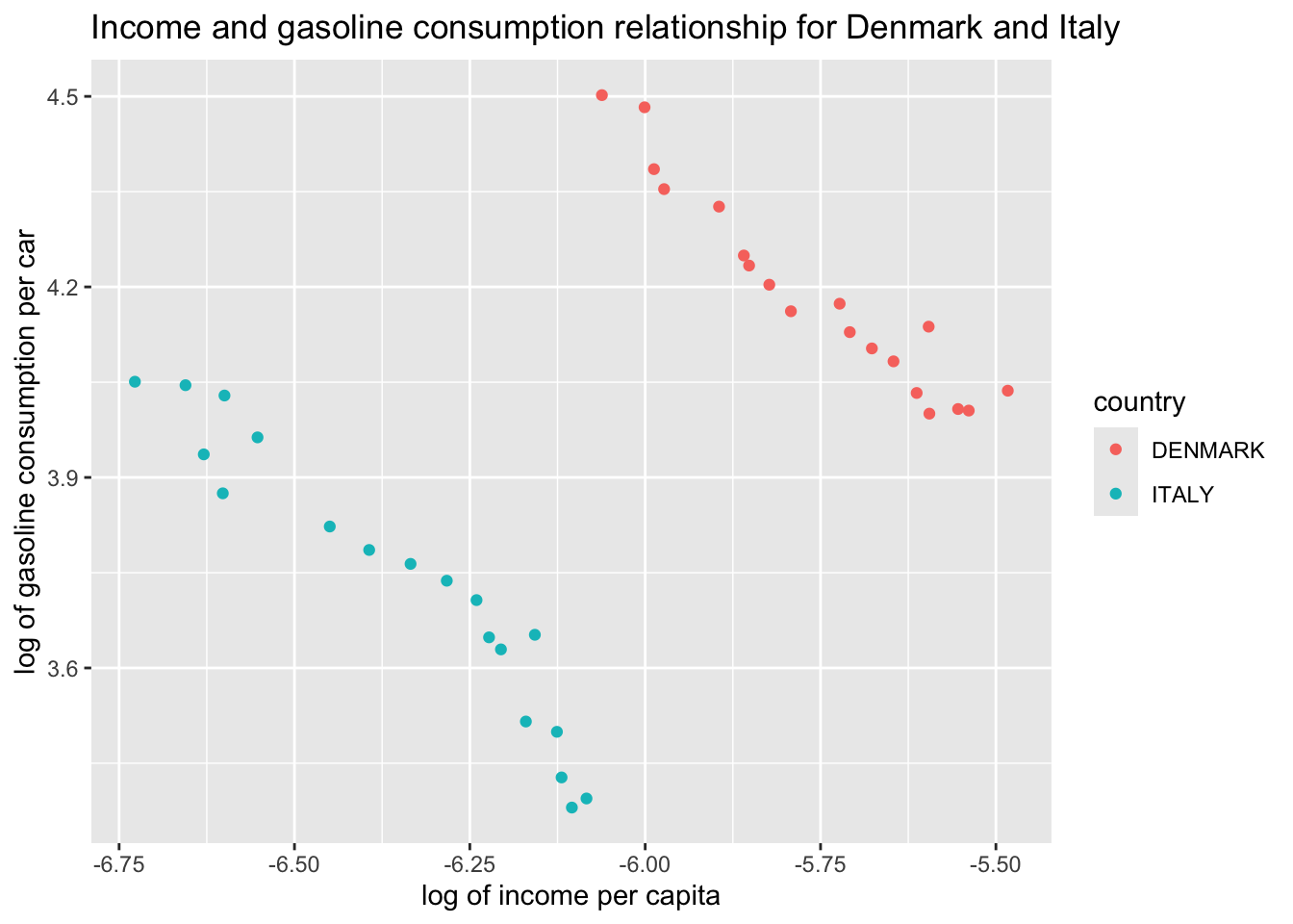
Let us dive into this deeper. First, let us see which data points belong to which country and then move on from there.
In the scatter plot, add separate colors for each country
ggplot(df, aes(x = L_income_pc, y = L_gas_cons_pcar)) +geom_point(aes(color = country)) +geom_smooth(method ="lm", se =FALSE) +labs(x ="log of income per capita", y ="log of gasoline consumption per car", title ="Income and gasoline consumption relationship for Denmark and Italy")
Saving 7 x 5 in image
`geom_smooth()` using formula = 'y ~ x'
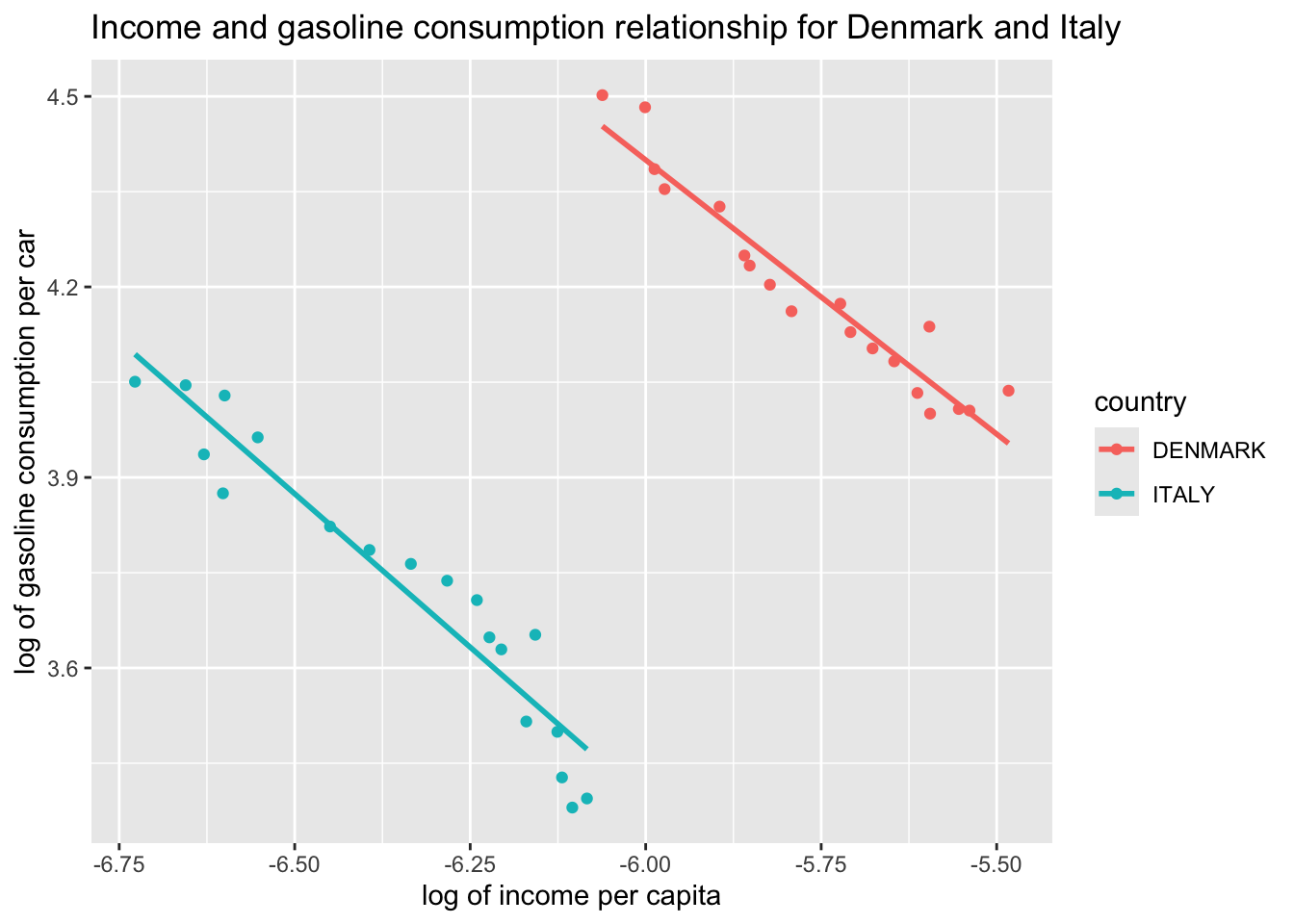
We can see a clear separation of Denmark and Italy. If we were to use separate country samples, rather than a pooled sample of the two, we would fit the regression lines below. Let’s start with the scatter and then add the regression lines:
ggplot(df, aes(x = L_income_pc, y = L_gas_cons_pcar, color = country)) +geom_point() +labs(x ="log of income per capita", y ="log of gasoline consumption per car", title ="Income and gasoline consumption relationship for Denmark and Italy")
ggplot(df, aes(x = L_income_pc, y = L_gas_cons_pcar, color = country)) +geom_point() +geom_smooth(method ="lm", se =FALSE) +labs(x ="log of income per capita", y ="log of gasoline consumption per car", title ="Income and gasoline consumption relationship for Denmark and Italy")
Estimate a pooled regression of gasoline consumption on income per capita.
We will be using our lm() function as we have done before:
pooled_ols <-lm(L_gas_cons_pcar ~ L_income_pc, data = df)summary(pooled_ols)
Call:
lm(formula = L_gas_cons_pcar ~ L_income_pc, data = df)

Residuals:
Logarithm of gasoline consumption per car
     Min       1Q   Median       3Q      Max
-0.56567 -0.14980  0.02645  0.20870  0.54445

Coefficients:
            Estimate Std. Error t value Pr(>|t|)
(Intercept)   5.6079     0.8004   7.006 3.22e-08 ***
L_income_pc   0.2723     0.1320   2.063   0.0464 *
---
Signif. codes:  0 '***' 0.001 '**' 0.01 '*' 0.05 '.' 0.1 ' ' 1

Residual standard error: 0.2878 on 36 degrees of freedom
Multiple R-squared:  0.1057,    Adjusted R-squared:  0.08085
F-statistic: 4.254 on 1 and 36 DF,  p-value: 0.04642
According to the results above, 1% increase in income per capita increases the gasoline consumption per car by 0.27%, on average.
11.1.6 Task 6
Create dummy variables representing each country in the sample and run the same regression above, this time including a country dummy (in the context of panel data anlysis, we will refer to this as the “country fixed effect”).
Re-run the above regression with denmark dummy. Can you explain why we do not include both italy and denmark but choose to include one of these countries only?
lsdv <-lm(L_gas_cons_pcar ~ L_income_pc + denmark, data = df)summary(lsdv)
Call:
lm(formula = L_gas_cons_pcar ~ L_income_pc + denmark, data = df)

Residuals:
Logarithm of gasoline consumption per car
      Min        1Q    Median        3Q       Max
-0.121945 -0.038747 -0.001717  0.035970  0.101286

Coefficients:
            Estimate Std. Error t value Pr(>|t|)
(Intercept) -2.14743    0.31063  -6.913 4.95e-08 ***
L_income_pc -0.92547    0.04887 -18.937  < 2e-16 ***
denmark      1.00963    0.03457  29.205  < 2e-16 ***
---
Signif. codes:  0 '***' 0.001 '**' 0.01 '*' 0.05 '.' 0.1 ' ' 1

Residual standard error: 0.05795 on 35 degrees of freedom
Multiple R-squared:  0.9647,    Adjusted R-squared:  0.9627
F-statistic: 478.9 on 2 and 35 DF,  p-value: < 2.2e-16
We see that in Denmark, on average, gasoline consumption per car is around 174% higher than in Italy, holding income per capita levels constant. Can you figure out how did we get that number?
Looking at the coefficient of L_income_pc, we can say that a 1% increase in income per capita, on average, decreases the gasoline consumption per car by around 0.93%. This is a very different figure than what we obtained using pooled OLS.
The model we estimated above using country dummies is using the Least Squares Dummy Variable approach.
11.1.7 Task 7
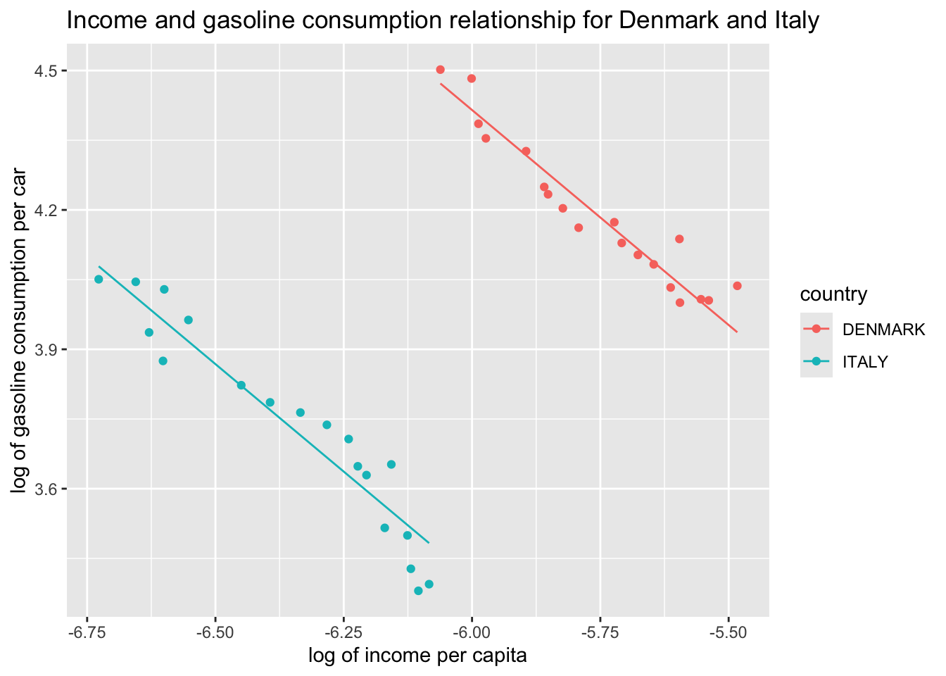
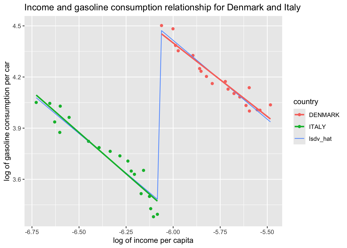
Plot predictions from the model estimated above.
df$lsdv_hat <-predict(lsdv)
ggplot(df, aes(x = L_income_pc, y = L_gas_cons_pcar, color = country)) +geom_point() +geom_line(aes(y = lsdv_hat)) +labs(x ="log of income per capita", y ="log of gasoline consumption per car", title ="Income and gasoline consumption relationship for Denmark and Italy")
The LSDV approach assumes a command slope for Italy and Denmark, but captures the constant distance between them through a country dummy. Note that the slope coefficient will give us the average effect for all countries in sample and will be different than the coefficients we would obtain if we were to estimate separate regressions for each country.
How does this compare to individual regressions (i.e. if we were to estimate each separately?). In the case of this example, we get very similar slope coefficients. But we will see on a larger sample that this is not always the case.
ggplot(df, aes(x = L_income_pc, y = L_gas_cons_pcar, color = country)) +geom_point() +geom_line(aes(y = lsdv_hat, color ="lsdv_hat")) +geom_smooth(method ="lm", se =FALSE) +labs(x ="log of income per capita", y ="log of gasoline consumption per car", title ="Income and gasoline consumption relationship for Denmark and Italy")
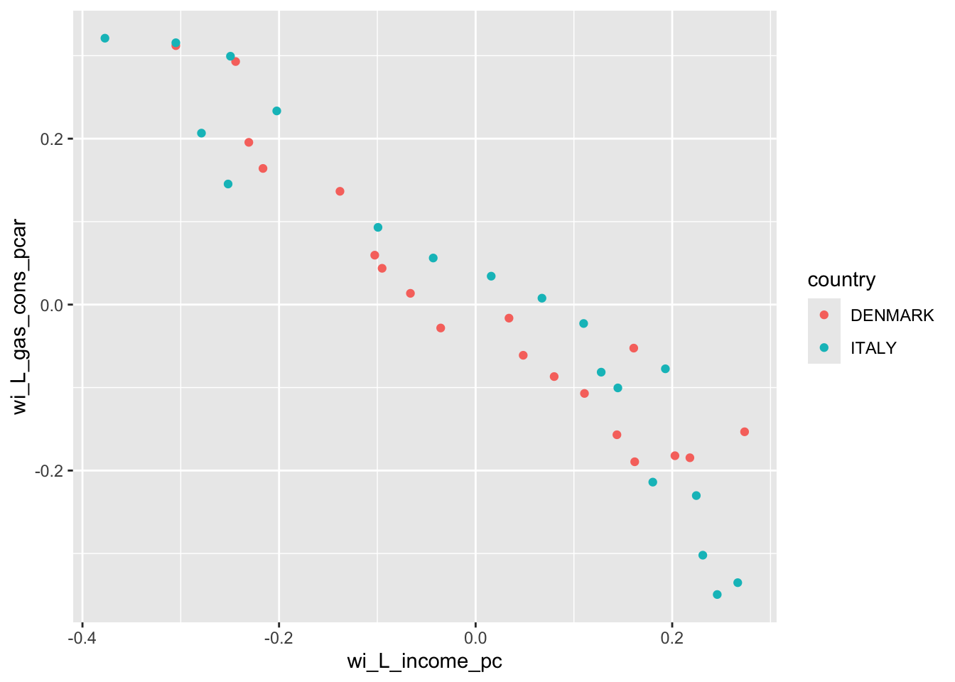
Run an OLS regression on the deviations from group averages without a constant.
11.1.9.1 Guidance
This is called the within-groups estimator. The slope coefficient that we obtain for our explanatory variable will be the same as the one obtained from LSDV approach, with a small difference in standard error estimates.
wg <-lm(wi_L_gas_cons_pcar ~0+ wi_L_income_pc, data = df)summary(wg)
Call:
lm(formula = wi_L_gas_cons_pcar ~ 0 + wi_L_income_pc, data = df)

Residuals:
Logarithm of gasoline consumption per car
      Min        1Q    Median        3Q       Max
-0.121945 -0.038747 -0.001717  0.035970  0.101286

Coefficients:
               Estimate Std. Error t value Pr(>|t|)
wi_L_income_pc -0.92547    0.04753  -19.47   <2e-16 ***
---
Signif. codes:  0 '***' 0.001 '**' 0.01 '*' 0.05 '.' 0.1 ' ' 1

Residual standard error: 0.05636 on 37 degrees of freedom
Multiple R-squared:  0.9111,    Adjusted R-squared:  0.9087
F-statistic: 379.1 on 1 and 37 DF,  p-value: < 2.2e-16