library(readxl)
library(ggplot2)10 Data Visualisation Using ggplot2
10.1 Example 1: Scatter plot with wage data
The exercises below are a selection from the “introduction to regression analysis” section. Load necessary libraries
10.1.1 Task 1
10.1.1.1 Task
Import wage.xls data. Alternatively, you may download and work on the wage-analysis project file.
10.1.1.2 Guidance
Use read_excel() and head() functions.
# install.packages("readxl")
#library(readxl)

# Import Excel data
wage2 <- read_excel("./assets/data/wage2.xls", sheet = "wage2")
10.1.2 Task 2
10.1.2.1 Task
Examine the relationship between education and wage using a scatter plot.
10.1.2.2 Guidance
We use the ggplot2 package to draw plots.
Education is expected to have a positive impact on wage. In our scatter plot, educ will be on the horizontal-axis while wage will be on the vertical-axis.
# Scatter plot
ggplot(wage2, aes(x = educ, y = wage)) +
  geom_point() +
  labs(title = "Scatter plot of Wage vs. Education", x = "Years of Schooling", y = "Wage")
You see above the full set of lines to create this plot. But let us do this step by step to have a better understanding. First, we bring the educ and wage variables from the wage2 data and position these on our plot.
ggplot(wage2, aes(x = educ, y = wage))
We then add (using the + sign), the observations in our data, represented by dots.
ggplot(wage2, aes(x = educ, y = wage)) +
geom_point() 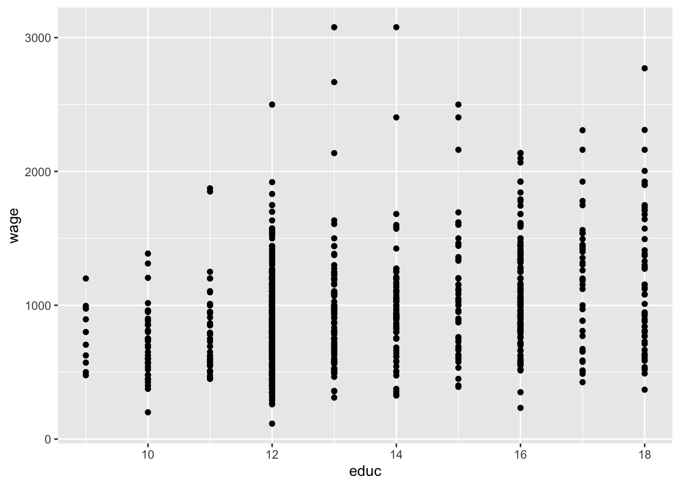
It is always good practice to give a title for your plot. Notice also that the horizontal and vertical axes above are labelled by the variable names. We may also replace these with proper definitions of the variables. This is to make it easier for the readers to understand your plots:
ggplot(wage2, aes(x = educ, y = wage)) +
  geom_point() +
  labs(title = "Scatter plot of Wage vs. Education", x = "Years of Schooling", y = "Wage")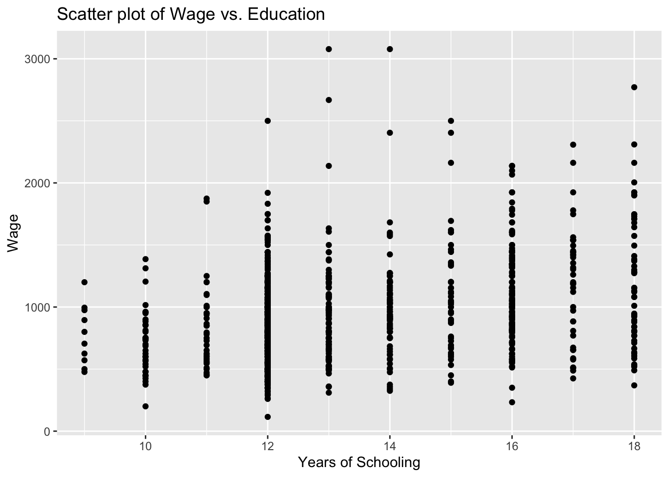
10.1.3 Task 3
Fit a regression line to the scatterplot you created
10.1.3.1 Guidance
We will be adding the regression line to the scatter plot we produced above.
# Scatter plot with fitted line
ggplot(wage2, aes(x = educ, y = wage)) +
  geom_point() +
  geom_smooth(method = "lm", se = FALSE) +
  labs(title = "Scatter plot with Fitted Line", x = "Years of Schooling", y = "Wage")
`geom_smooth()` using formula = 'y ~ x'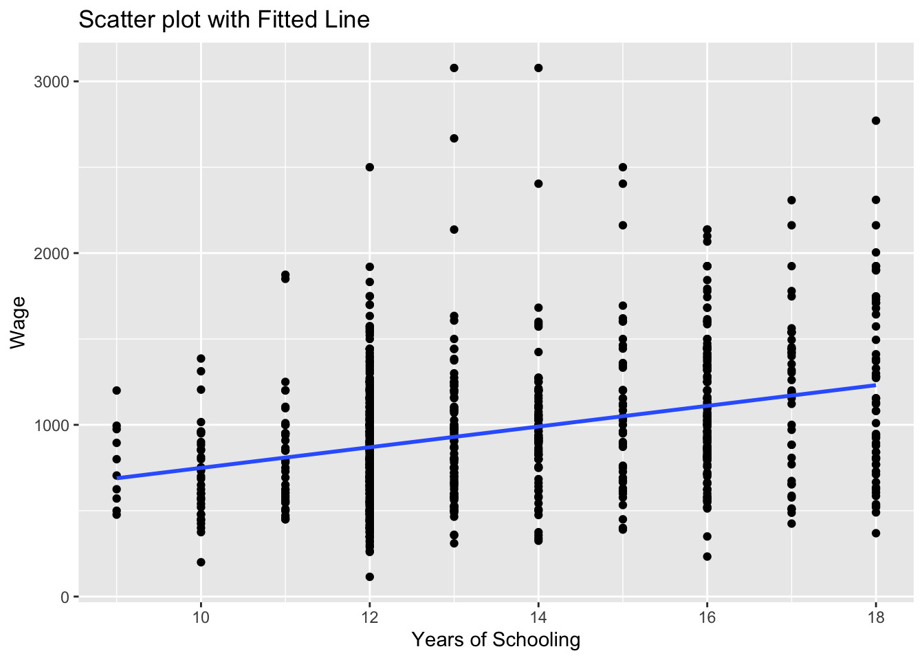
the geom_smooth(method = "lm") asks R to add a line estimating a “linear model” (i.e. a regression) of wage on educ.
Note that we could save this plot as an object by assigning it a name on the left hand side of the command. We will do that below and name the plot as scatter_wage_educ.
Can you guess what the plot would look if we changed se = FALSE to se = TRUE above? We can also try that below:
# Scatter plot with fitted line
scatter_wage_educ <- ggplot(wage2, aes(x = educ, y = wage)) +
                        geom_point() +
                        geom_smooth(method = "lm", se = TRUE) +
                        labs(title = "Scatter plot with Fitted Line", x = "Years of Schooling", y = "Wage")
print(scatter_wage_educ)
`geom_smooth()` using formula = 'y ~ x'
We could also add this sample regression line by saving predictions after estimation of a wage regression and using these predictons.
We use the lm() function to estimate linear regression models.
# Linear regression
model_1 <- lm(wage ~ educ, data = wage2)
summary(model_1)
Call:
lm(formula = wage ~ educ, data = wage2)

Residuals:
    Min      1Q  Median      3Q     Max
-877.38 -268.63  -38.38  207.05 2148.26

Coefficients:
            Estimate Std. Error t value Pr(>|t|)
(Intercept)  146.952     77.715   1.891   0.0589 .
educ          60.214      5.695  10.573   <2e-16 ***
---
Signif. codes:  0 '***' 0.001 '**' 0.01 '*' 0.05 '.' 0.1 ' ' 1

Residual standard error: 382.3 on 933 degrees of freedom
Multiple R-squared:  0.107, Adjusted R-squared:  0.106
F-statistic: 111.8 on 1 and 933 DF,  p-value: < 2.2e-16
Using the regression model above, we can predict what the wage would be for given values of education (how much do we expect the wage would be for given years of schooling).
# Save predicted values under name wage_hat
wage2$wage_hat <- predict(model_1)
We can now add the estimated regression line to the wage-education scatter plot.
# Scatter plot with fitted line
# we add the wage_hat variable
ggplot(wage2, aes(x = educ, y = wage)) +
  geom_point() +
  geom_line(aes(y = wage_hat), color = "blue", size = 1) +
  labs(title = "Scatter plot with Fitted Line", x = "Years of Schooling", y = "Wage")
Warning: Using `size` aesthetic for lines was deprecated in ggplot2 3.4.0.
ℹ Please use `linewidth` instead.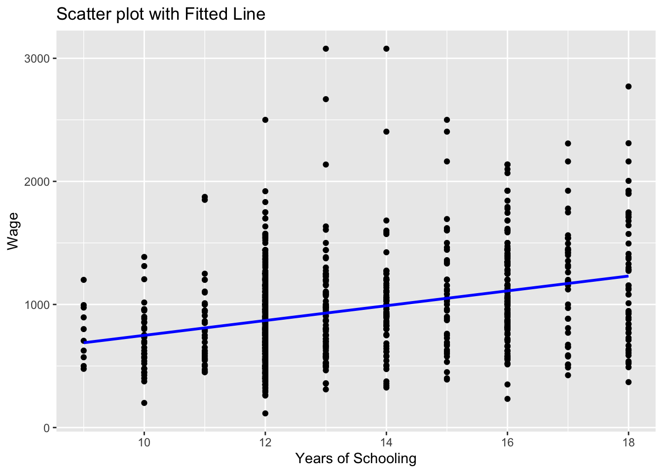
Note that we used geom_line() this time to add a line plot of an already existing variable in the data set.
ggplot(wage2, aes(x = educ, y = wage))creates a canvas, a plot area with educ at the horizontal and wage at the vertical axisgeom_point()adds a scatterplot ofwageagainsteduc.geom_line(aes(y = wage_hat))adds the line for the predictedwage_hatvalues. Theaes(y = wage_hat)ensures the line graph useswage_haton the y-axis while sharing the x-axis (educ).colorandsizeare optional for styling the line. Try experimenting with these and observe the changes.
10.2 Example 2: Histogram of error term using wage2 data
The following example is taken from “multiple regression and diagnostic checks” section.
10.2.1 Task 4
Estiamte a multiple regression of wage using IQ, educ, exper, urban. Provide a histogram of the error terms.
10.2.1.1 Guidance
model_3 <- lm(wage ~ IQ + educ + exper + urban, data = wage2)
wage2$resid_m3 <- residuals(model_3)
Plot the residuals to see the distribution.
ggplot(wage2, aes(x = resid_m3)) +
  geom_histogram(binwidth = 200, fill = "skyblue", color = "black") +
  labs(title = "Histogram of Residuals (model_3)", x = "Residuals", y = "Frequency") +
  theme_minimal()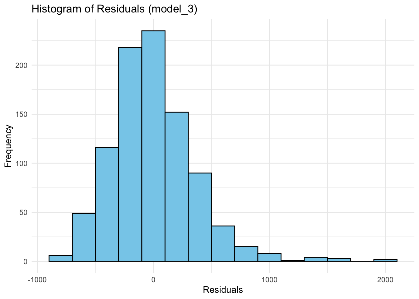
aes(x = resid)specifies the residuals as the variable for the x-axis.geom_histogram()is used to create the histogram:binwidth = 200controls the width of the bins. You can adjust this depending on how detailed you want the histogram to be.fillsets the color inside the bars, andcoloradds a border around them for better visibility.
labs()adds labels for the title and axes.theme_minimal()gives a clean, simple look to the plot - try the plot with and without this.
You may also let ggplot choose the number of bins automatically:
ggplot(wage2, aes(x = resid_m3)) +
  geom_histogram(fill = "pink", color = "black") +
  labs(title = "Histogram of Residuals (model_3)", x = "Residuals", y = "Frequency") +
  theme_minimal()
`stat_bin()` using `bins = 30`. Pick better value with `binwidth`.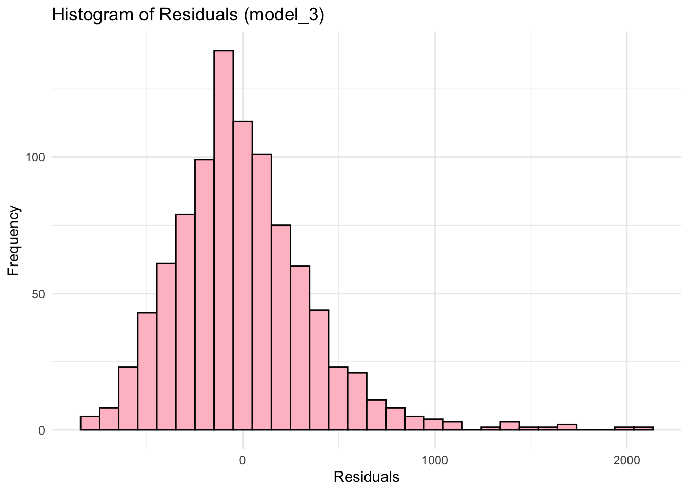
10.3 Example 3: Line plots using Gap_sales data
The following examples are from the “introduction to time series analysis” section.
Start by reading the data
df <- read.csv("~/Desktop/R-workshops/assets/data/GAP_Sales.csv", stringsAsFactors=TRUE)ggplot(df, aes(x = Time, y = Sales)) +
geom_line() +
theme_minimal()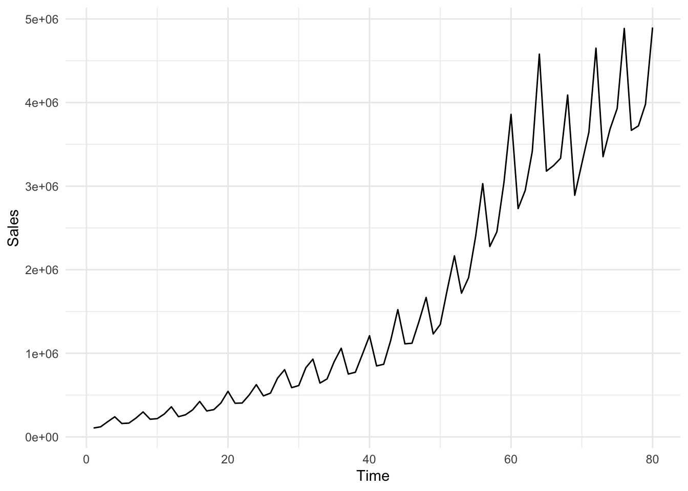
You may add some color and change the size of the line
ggplot(df, aes(x = Time, y = Sales)) +
  geom_line(color = "blue", size = 1) +
  theme_minimal()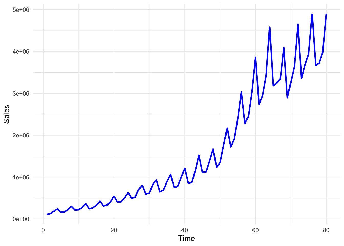
In the above plot, although we can see the pattern of the Sales variable quite clearly, the Time variable labels fail to show us the respective quarter values. We may change these labels by using the following lines of code.
We first define labels to correspond to each data point
# First, create a new column for formatted quarter labels
df$Quarter_label <- paste0(df$Year, ":", df$quarter)
Check the values of Quarter_label in the df. You will see that it goes on like 1985:q1, 1985:q2, and so on. We may now use these labels instead of the values of the Time variable.
ggplot(df, aes(x = Time, y = Sales)) +
  geom_line(color = "blue", size = 1) +
  scale_x_continuous(
    breaks = df$Time,  # Position the breaks at each quarter, i.e. at each value of Time
    labels = df$Quarter_label  # Label each point using Quarter_label variable created above
  ) + # provide a title and axes labels below
  labs(title = "Quarterly GAP Sales", x = "Quarter", y = "Sales") +
  theme_minimal() +
  theme(axis.text.x = element_text(angle = 90, size=6))  # Rotate labels for better readability using the angle option and set the font size for label using size option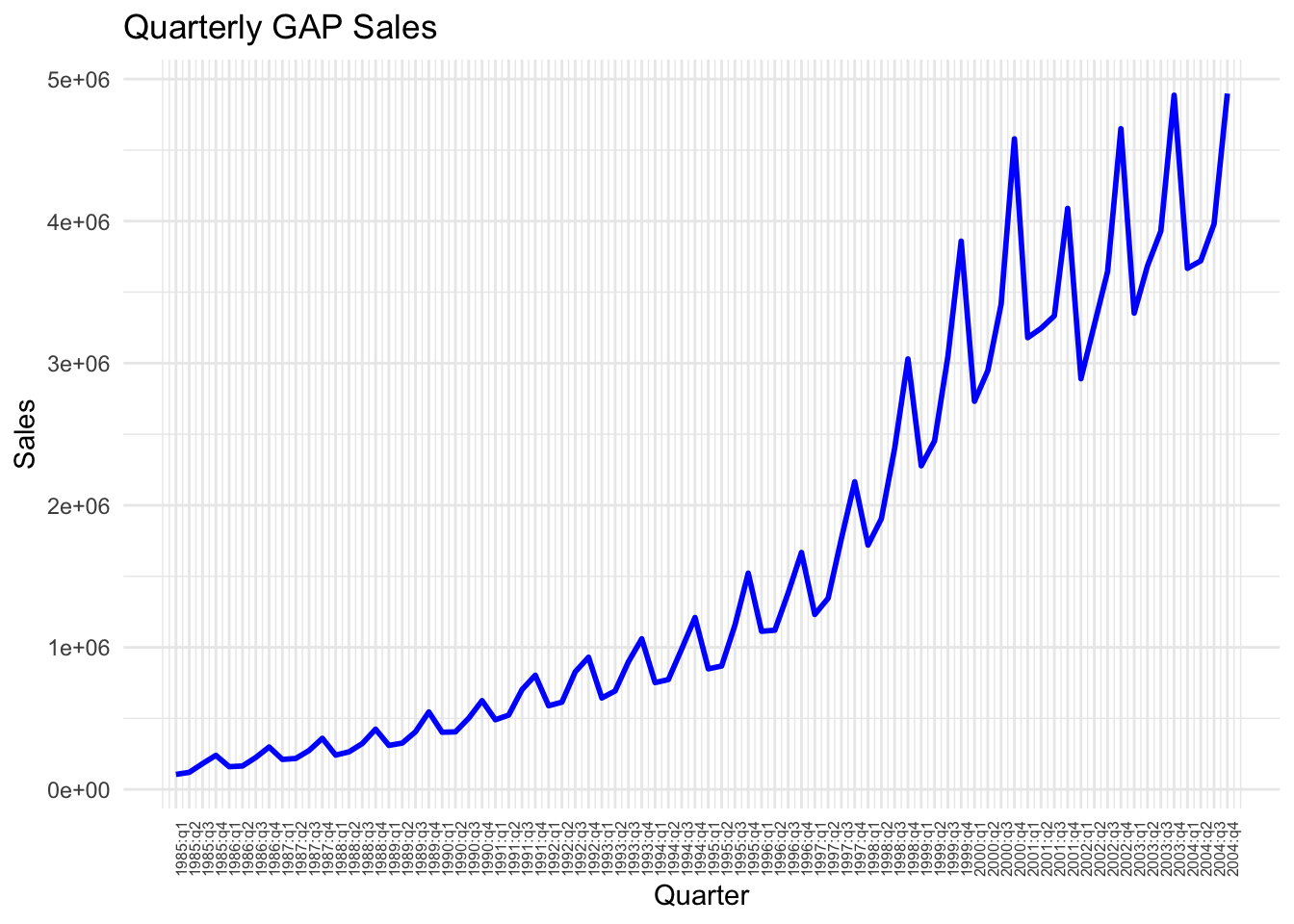
# Estimate the model using trend and quarter dummies
df$ln_sales = log(df$Sales)
model_3 <- lm(ln_sales ~ Time + Q2 + Q3 + Q4, data = df)
# Obtain predictions from model_3
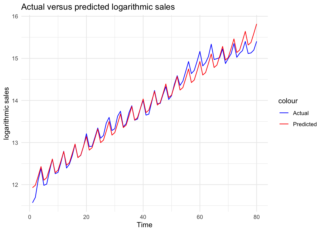
df$ln_sales_hat_m3 <- predict(model_3)Plot the actual values against predictions to see the improvement by the inclusion of the quarter
# Plot actual versus predicted log sales
ggplot(df, aes(x = Time)) +
  geom_line(aes(y = ln_sales, color = "Actual")) +
  geom_line(aes(y = ln_sales_hat_m3, color = "Predicted")) +
  theme_minimal() +
  labs(title = "Actual versus predicted logarithmic sales", x = "Time", y = "logarithmic sales")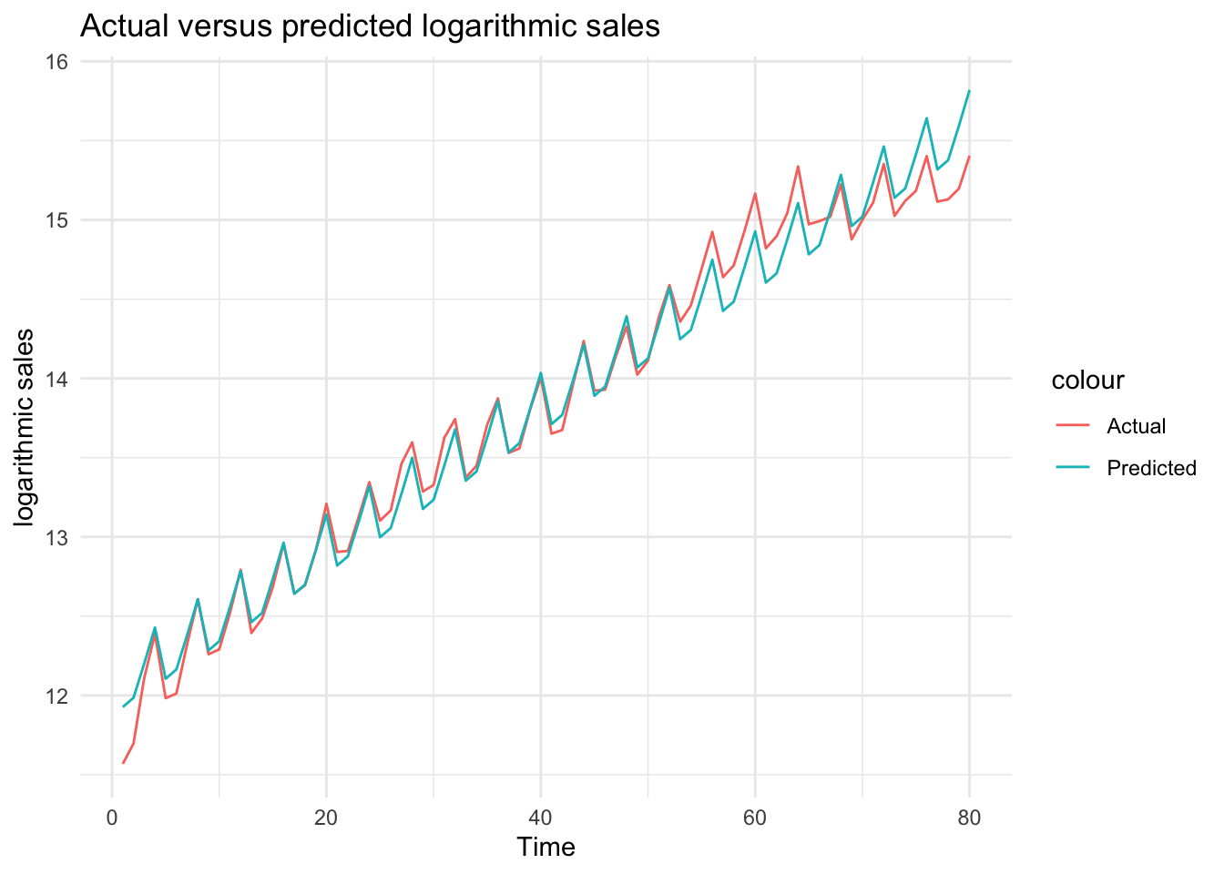
Change the color of the lines
ggplot(df, aes(x = Time)) +
  geom_line(aes(y = ln_sales, color = "Actual")) +
  geom_line(aes(y = ln_sales_hat_m3, color = "Predicted")) +
  scale_color_manual(values = c("Actual" = "blue", "Predicted" = "red")) +
  theme_minimal() +
  labs(title = "Actual versus predicted logarithmic sales", x = "Time", y = "logarithmic sales")